Global Styleguide v4.6 — visual review page
This page is a controlled “design mirror”: it applies the v4.6 styling locally so you can judge Wertigkeit & Wohlfühlen without touching the global runtime.
Links are not underlined by default; underline appears on hover/focus. Headline underline is automatic. Scroll to the sections below to review every component.
Calm
Design-led
Privacy
Clear terms
Typography & link behavior
Heading level 3 (with underline)
This paragraph demonstrates the base text styling. Here is a normal inline link: Direct booking benefits. And here is another: Experiences hub.
Muted text is used for calm guidance and secondary context without shouting.
Buttons
Primary is gold by default. Secondary is outlined. Hover lifts slightly.
Panel example: use this for calm hints (arrival, parking notes, policy snapshots). Keep it short.
Grid & cards
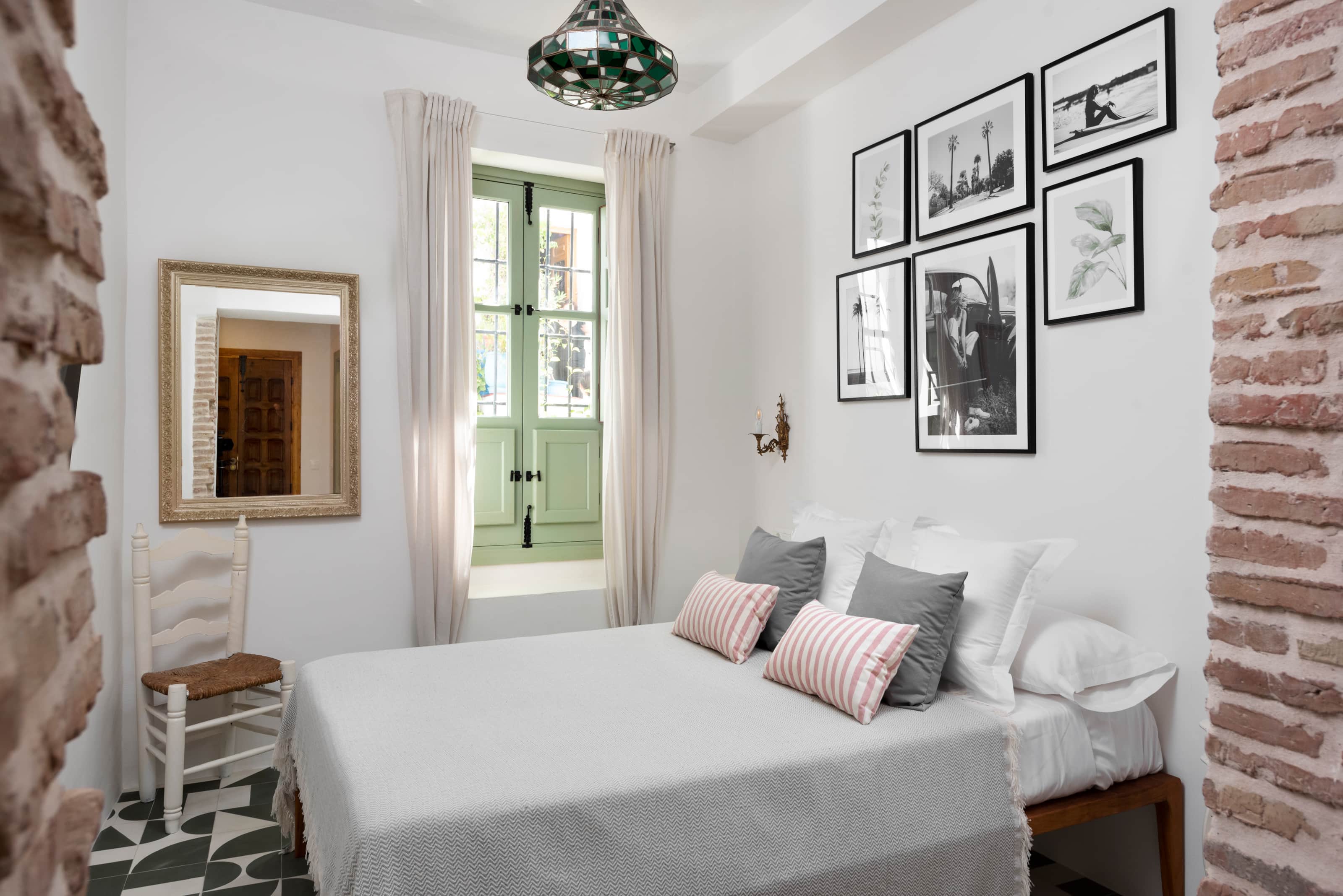
This is the “default content card language” used across AMARA modules: clean borders, soft shadow on hover, strong meta label, and a calm description.
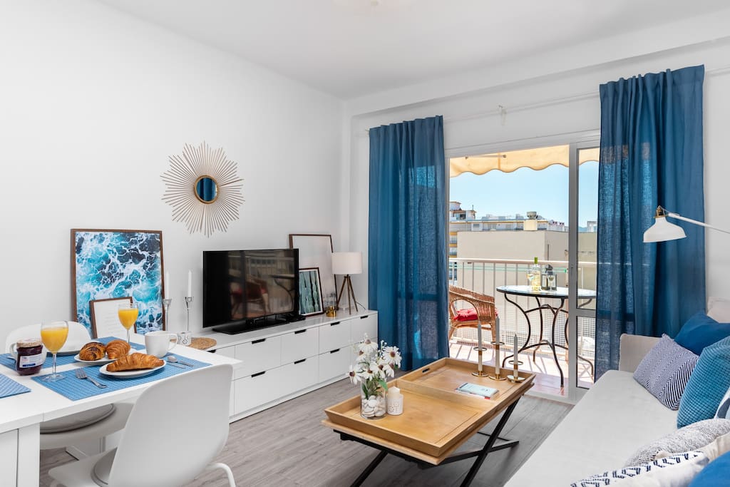
Second card
Cards keep images square (no rounded image corners). The card container can be rounded.
Sea mornings
Slow rhythm
FAQ (native details)
Is AMARA a hotel?
AMARA is a small collection of self-catered homes. You get privacy, space, and a calmer rhythm.
Where do I check availability?
Use the booking page for live availability across the collection: open booking.
Do you have an experiences guide?
Yes — one hub page keeps it tidy: Experiences around Frigiliana & Nerja.
Home legacy block support
Below is a nested demo of #amara-multilang-content. This mimics legacy home widgets.
Hero title stays H2 (system H1 belongs to Lodgify).
AMARA Romantic Hideaways
Quiet romantic stays in Andalusia
Legacy home demo. The goal is consistent typography, buttons, and link behavior — without global overrides.
Amenities & policies – demo section
This block demonstrates the conversion styling used for “Amenities/Policies” style pages: calm density, strong headings, clean specs, no visual clutter.
STRICT GRID specs
Booking
Direct booking available via our official booking page.
Cancellation
Clear policies, kept short. (Replace with your exact policy text.)
Pets
On request • small daily fee may apply.
Conversion card
Use this for policy highlights, arrival notes, or “why book direct”. Calm, short, and easy to scan.